Because we have 23 million Americans who have not graduated high school.
Because we have 44.7 million immigrants that are likely English as Second Language (ESL).
Because we are not all specialist and jargon makes it harder to understand.
Informing and Educating
When trying to teach someone something, whether a class, infographic or directions, we have to think about why we are doing it.
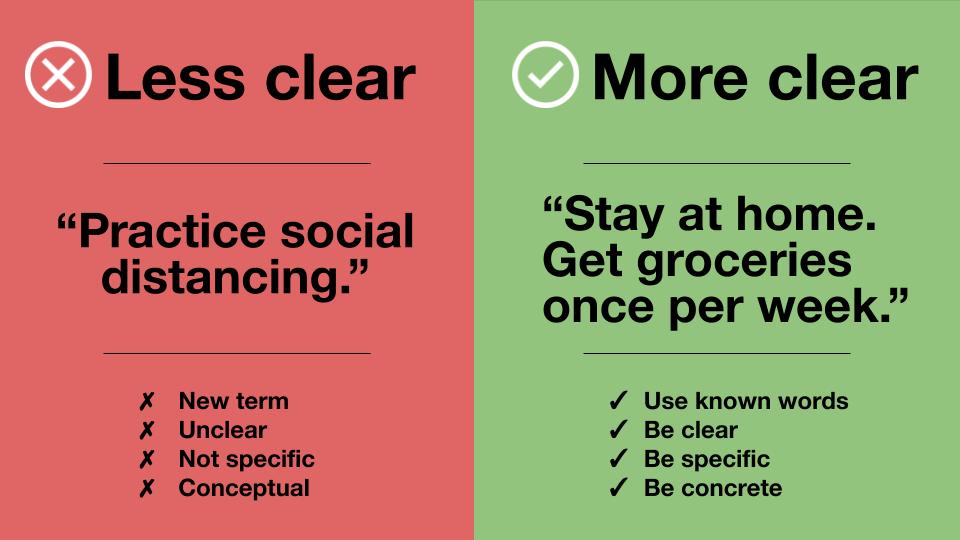
If the purpose is to sound smart, then do that in your boardrooms and conferences. If the purpose is to help someone understand something, then Keep It Short and Simple (KISS).
Before I get a ton of comments saying KISS stands for Keep It Simple Stupid, please note:
a) calling people names is not helpful b) the focus is on making things easier for people
Keeping it Simple
Simple is really simple to do.
Essentially you must explain-it-like-I’m-five (ELI5). If you want everyone to understand, you take it down to basic level and use terms that everyone can easily understand – even five-year-old children.
Take the information apart to the most basic building blocks, then share what they need to know first for a basic foundation. From there, build on the knowledge you’ve given them (assuming they know nothing else).
Just like when we explain concepts and actions to small children, use language based on the fact they have never done it before. Children don’t have context to draw from or years of experience to know what you are talking about (so no business jargon).
While you may be the expert on what you do, everyone else is like a five-year-old. So don’t be patronizing, but be a parent (or aunt).
Keeping it Short
While you are keeping it simple, break it down to bite size pieces. Here’s some tips on how to write informational and educational content (especially if doing it for online materials).
Paragraphs: Make it about four sentences. Provide relevant and related information. A new idea/concept is a new paragraph.
Sentences: Keep at 12 words or less. Use active voice and direct language.
Bullet points/lists: Super easy to scan. Be consistent with capitalizations, punctuations, and verbs.
Text Alignment: Because people read left-to-right, left-aligned is easier for people to scan. Center text should be used sparingly, and right aligned should almost never happen.
In 2017 we have unprecedented access to information via the web. When anyone can create a website or post to a blog, the web becomes a virtual playground for false information. “Fake news” has received a lot of hype recently, especially in terms of politics. This trending topic points to a bigger issue. We live in an age of unverified sources. How do we sort through all this information? And how do we provide reputable, well-researched web content?
Be A Source People Can Trust
If you want to seem credible, speaking and writing the truth matters. Most often fake news gets out of control because of our own personal biases, likethe truth bias.
The truth bias is fundamentally based in trust. We want to believe those we engage with are trustworthy, honest people. According to experts, trust is crucial in all relationships, including customer-business relationships.
Imagine you’re running a non-profit for stray animals. You post a statistic about how many strays are euthanized each year. You read the stat on a blog you’re not too familiar with, but the information seems right to you, and it’s sure to bring in donations. Then one of your followers calls you out. Your statistic was not only wrong, but heavily inflated. How will this affect your non-profit? If your statistics aren’t trustworthy, what else isn’t? Maybe people will worry you’re a scam and stop donating.
When we don’t fact-check before posting online we aren’t deliberately lying, but when people see you promoting false information, they will stop trusting you.
It’s time to stop seeming like you know what you’re talking about, and start actually knowing what you’re talking about. The key to this? Careful, thorough research.
Finding the Truth
Most news sources or companies like to appear as experts, but they all use data to fit their bias.
For example, two different television stations could do a story on homelessness in your city. They both get the same facts about the percentage of people living in shelters (3% of population), how it’s compared to the other cities your size (yours has 30% more), and the amount of nonprofits helping the issue (6).
Station 1 angle: We have 6 nonprofits helping the 300 people living in shelters. They provide most of these people with food, showers, and clothing.
Station 2 angle: Compared to other city our same size, we have 30% more homeless people. That’s 3% of our population. Why does our city have such a big problem?
Online Sources
Say you come across this tweet: “New studies say coffee drinkers live longer.” Does this mean you should start downing extra coffee? Depends. Was it a study from their own company? How did they collect their data (was it self-reported or were doctors involved)?
When online quickly assess a website’s credibility by:
Looking for websites with print counterparts (ex.Psychology Today).
Avoid poorly built/designed websites, as they were probably built quickly and cheaply to appear legit.
Read the author bio to ensure the author is someone in the field/industry.
Using Credible Sources Accurately
Some resources may leave out crucial information, conduct surface-level research, and cherry pick for the information they wanted. Below are three tips to find credible sources (for anything).
Look for (and Include) Counter Arguments
You’ll find onCNN andCNBC that the coffee fact you read on Twitter is true. Sort of. While both articles point to new research that says coffee drinkers live longer, they also both point out that drinking coffee may not be the cause of long life, but rather a habit indicative of an already healthier lifestyle.
Show your readers you’re trustworthy by including credible counter arguments and mentioning any uncertainty in the data.
Track Information Back to the Primary Source
News sites generally provide an overview of the research, but if you want more than surface-level information, you need to go back to the original source (who conducted/found the information). In the case of our tweet, this would be theoriginal studies conducted on coffee drinkers, published in the Annals of Internal Medicine.
How to Access Original Studies:
Local libraries with access to databases such as EBSCOhost.
Paid subscription to the journal in question.
Free pdfs of articles searchable via Google.
Be Aware of Your Bias
You’ve probably heard at least once in your life that pink is a favorite color of women. A google search of, “why women like pink,” produces afairly reputable Time article which summarizes a study that suggests women may be biologically programmed to prefer pink. It is human nature to stop research here:confirmation bias shows that people give more credence to information that confirms what they already believe, while doubting information that contradicts their beliefs.
If you search further (maybe typing in the opposite of what you believe) you’ll find that, despite this biological predisposition, pinkranks very low among women’s favorite colors.
To keep your confirmation bias in check:
Keep searches general enough that you’ll be able to easily find all the information you need—not just that which confirms your bias.
Avoid scrolling through the Google results and clicking on links that ONLY confirms what you already think you know.
Hold integrity at its highest, and be willing to shift your beliefs based on fact. Because if you’re not trustworthy, your customers won’t think your business will be either.
She said she would like to see my resume and portfolio for a content strategist job.
“Are you sure?” I wrote back. Seriously.
It’s not that I have low self-esteem. Maybe about my body, but not about my work. In fact, my work is the one aspect in my life that I’m absolutely sure about. I am constantly testing my skills (part of the job), reading every new book in the industry, and if I don’t know something, I’ll learn as much as I can until I get it right.
So when I asked, “Are you sure?” it was more about the job itself.
When she sent me the job description and I was like, “While I’m honored to be considered by Facebook, I’m not sure I’m the right fit. I haven’t been focused on writing for a while; I’ve been doing mostly information architecture and interaction design for the last few years.”
She said that she’d like me to send my stuff over anyways.
Any kind of information you digest is considered content:
Copy
Images
Infographics
Video
Unfortunately, some companies think they want a content strategist when what they really want is a UX writer or editor. UX writers are incredibly good at creating and labelling content, but their focus is mostly on the words – telling stories and instructing users.
Content strategy is not. just. writing.
What a Content Strategist actually does:
Analyze content (finding out what content users are interacting with)
Organize content (what type of content goes where)
Manage content (how it’s updated and who does it)
Govern content (ensuring it stays within company’s brand)
Market content (assists with types of content used and editorial calendar)
There’s more, but these are the top five elements.
Now Facebook’s description was very vague. The description also seemed to emphasize content, not strategy. Especially concerning the types of samples they requested- a lot more copy-centric then how/why we made decisions.
The Interviews
Even with my hesitancy and unclear expectations, I sent in my stuff. It is Facebook after all, so I would at least get a cool story or blog posts about it. (Running poll: Can I put this on my resume?)
Phone Interview
Pretty standard. The woman asked me questions about my background and my skillset. She mentioned that there were many “villages” at Facebook – meaning it wasn’t a big corporate structure. Each team worked on specific parts of Facebook.
I asked for a more detailed description, and she said they were vague on purpose because they were potentially filling up to 50 roles.
50?!? Yea, knowing the number does make one feel slightly worse about not getting the job.
But why so many? I have worked on some big websites, and I’ve never had more than one content strategist. Maybe two or three, and I often do some of the work as an Information Architect as well, but that seems like overkill.
Strategy is about the big picture, overall direction towards a goal, and the steps to get there. If there’s 50 different villages that are getting their own strategist, who is in charge of organizing the strategists’ strategies?
Video Interview
Since I’m pleasant enough on the phone, I was then scheduled a video interview. The interviewer was a super nice guy who worked at instagram. We talked and joked about how no one really understands what we do.
I had sent in samples that were mostly strategy related; personas, flows, digital campaign numbers. The one he wants to talk about? The user interface copy that was highly regulated by legal.
I, again, asked about the role, and he talked about how the different groups are like their own separate villages. I’m beginning to see a pattern here.
Didn’t have to wait long, as I got a call that night to talk about the next step.
The Design Challenge
A design challenge is a way for companies to get new ideas without paying people for it. I’m kidding (sort of).
A design challenge is a way for a company to see what your skills/thinking/process are before hiring you (much like a portfolio). They’ll ask you to complete a task or two (without data or research) and you come up with a solution in the vacuum (thus not really understanding your thinking because you have no data to analyze).
Facebook gives you two days to do three tasks. Two of these tasks are issues you decide you want to fix (one desktop, one mobile) and then one task they give you.
Design Challenge Example
I’m going to share only one of my solutions with you, and mostly so when they come out with it in a 8 months, I can have proof it’s my idea (kidding, sort of).
Problem: Not All Users are the Same
I really, really hate it when I (accidently) end up in a facebook argument, or some other heavily commented section, and I lose other notifications in the craziness. I’ve also previously been a mod in a group and it would be notifications ALL THE TIME. Anything else would get lost in the mess.
The worst of it: I am both a personal user and a business page user. My biggest pet peeve is that whenever I get a BUSINESS notification it’s mixed in with all those political posts notifications, so even if I didn’t want to care about work in that moment, I am now back in business mode.
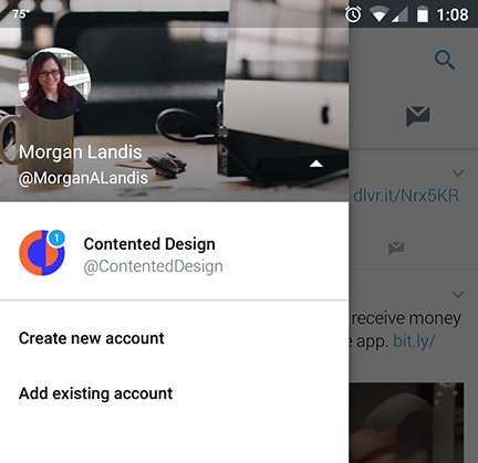
Solution: Differentiated Profiles and Notifications
Restructuring information on the home page, specifically the navigation and notifications, so that different users (i.e. traditional user and business user) can quickly access the information/task they want.
Simplified: I want a separate experience for my business page vs. my personal page.
First, you’d have different profiles that you could switch between with a tally of their notifications. Much like how twitter does it now:
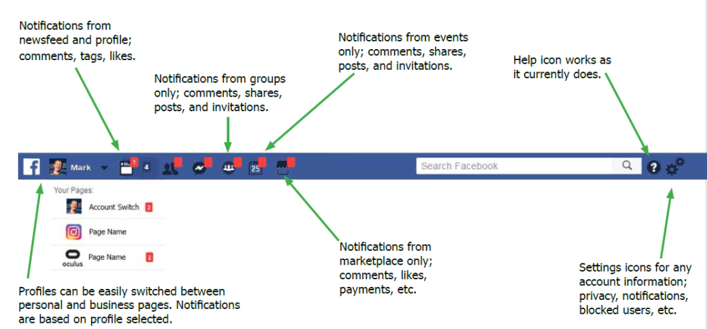
Second, it would be separated by the type of notification; newsfeed (conversations/posts), friend requests, messenger, groups, events, and marketplace.
Not only does this separate business and personal use, but it’s also great for group moderators who will be quickly aware if there’s a fire going on. And why wade through game invites when all you want to know is an event’s posting?
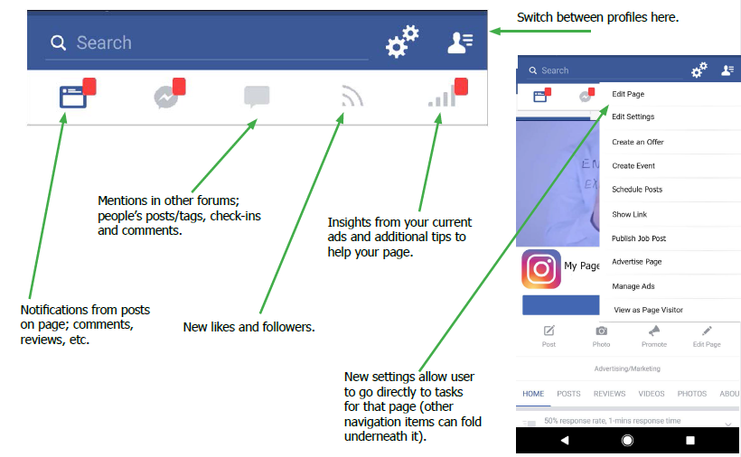
The strategy is also translated for business pages (this is the mobile version of it).
There would also be additional changes to layouts on both desktop and mobile, so that the whole product works together well, but for a weekend, I felt like this was a good start.
Again, I must mention, this is without any analytics, research, technical constraints, etc., so I don’t know if any of this is wanted or feasible. My driving force was empathy and a strong instinct that business users and personal users are coming to Facebook for two different goals and tasks – thus should be treated differently.
I Will Not Be Working at Facebook
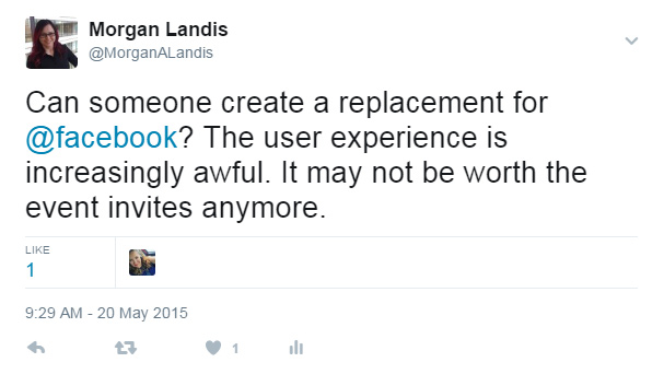
Interviewing at Facebook was definitely an unique experience. I was giddy with excitement, wrecked with nerves, cried from disappointment. Why didn’t they choose me? I’m not sure. Maybe I didn’t fit the role. Maybe they could tell I wasn’t in love with Facebook. Maybe they saw this tweet from 2015:
Overall, I think three rounds of interviews is pretty good. It made me realize I want to do more. To work on bigger projects. To continue on the strategy of creating and implementing new ideas and solutions.
And hey… if Google wants to interview I won’t say no. I have some great ideas about education and Virtual Reality.
Have you been on a website or app and can’t find the information you want?
The navigation isn’t taking you anywhere, the search bar (if there is one) isn’t giving you answers you need, and you can’t find something that should be simple to find.
Or worse – you’re using a machine or software and trying to finish a process and the steps don’t make sense. Or you need to go back and change something but don’t know how. Or you keep getting an error and you don’t know why.
My job is to make sure this doesn’t happen.
Technically there are a few names/positions that I do in the user experience field:
Basically I design information, processes, and interactions so that you (the user) can find what you need and/or finish what you started in the most efficient, effective, and engaging way possible.
I call myself an Information Designer.
I design the service or product so that you get the information you want when you need it, includinghow and when you receive that information.
This means deciding when to use:
Media (presents information in images, video, etc.)
Modals/popups (gives you additional information)
Instructive copy (provides error fixes)
Notifications (alerts you to what you pay attention to)
Email transactions (reminds you to complete a process)
All of these are different ways, or interactions, that make it a better, easier experience for you.
Designs are based on data, analytics, and psychology.
This isn’t about making something pretty. There are plenty of pretty products out there, but eventually they age, or are not useful, so a better version replaces them.
Creating a feature, laying out a page, or deciding an interaction is about the science of how people interact with technology and information, in the real world and online.
To design a digital interaction, the data tells me that:
Eyes follow an “f” or “z” frame on desktop views
Eyes get tired with too much contrast
Content is skimmed so use bullets and headers wisely
Colors can cause someone to pay attention and/or react negatively
Interactions need to be consistent for users to trust your site
These guidelines are based on years of research, psychology, and data that comes directly from your users.
My designs will always be based on what works, not what is trendy.
Flash fades (or dies), but your users will never forget how your product makes them feel. Ensure they are content with clean, creative, and concise designs.